dōTERRA of Pleasant Grove, UT, is the leading producer of essential oils, having a 23% share of the global market. With its name a Latin derivative meaning “gift of the earth,” the company embraces the mission of sharing therapeutic-grade essential oils with the world. According to Missy Larsen, Vice President Corporate Communications for dōTERRA, when the company was launched in 2008, its seven founders were among the first to recognize the health benefits of essential oils.
“They were really visionary in the way they looked at personalized healthcare and at alternative ways to increase physical and mental functions through essential oils,” she explains.
dōTERRA’s first products included 25 single oils and 10 blends. Today it offers more than 100 CPTC Certified Pure Therapeutic Grade® essential oils, from which it also creates blends, sourced from over 40 nations. In addition, it sells nutritional, spa, and healthy living products based on essential oil technologies and a comprehensive wellness philosophy. In total, its global number of SKUs tops 10,000.
In dōTERRA’s early days, label design was simple. Since its essential oil products are just that—essential oils and nothing else—their label required little copy. For example, a list of ingredients for its peppermint oil included “peppermint oil.” But as FDA regulations grew, dōTERRA was forced to add more text. Despite the tiny 5-mL and 15-mL size of its bottles, it was successful in including all the required information on its U.S. labels. But as it prepared to launch in Canada in 2014, it learned this information had to be added in French, as well.
Looking for a solution that would allow it to meet the new regulations while retaining the aesthetics of its premium product and keep costs low, dōTERRA turned to its long-time label supplier Kala Packaging.
A clean and cost-effective solution
Traditionally, Consumer Packaged Goods companies that require dual-language labels for their products might use one of several options. Among them, a separate carton with a leaflet inserted along with the bottle, or a peel-back, booklet-style label that meshes two materials together.
Says Kala Senior Account Executive Jerrie Wilson, “dōTERRA was thinking they might have to put a piece of collateral material in a folding carton with each bottle, which would have been a departure from their norm as well as expensive. And actually, when they investigated it, it wouldn’t have complied with regulations anyway, because the information had to be on the bottle itself.”
For its European labels, dōTERRA uses a fold-out booklet-style label to accommodate 12 languages. According to Todd Purser, Senior Manager, Creative Services and Brand Marketing for dōTERRA, “it just doesn’t look clean.” He explains, “There’s a little ridge on the label when the booklet is added. And, once the booklet is folded out, it’s hard to fold it back up and get it all back in and tucked under.” For the Canadian market, dōTERRA was looking for something that would preserve the clean and streamlined design of its existing labels.
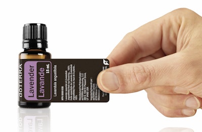
At the time dōTERRA approached Kala for help on the Canadian label, the converter had already been “theoretically thinking a lot about a wraparound peel back-style label,” says Wilson, so they used the opportunity to explore the option for dōTERRA.
“We took one of their existing labels and created a prototype with a modified length,” explains Wilson. “Our theory was that the surface-tension difference between the glass bottle and the label would provide enough differential that the peeling portion would, number one, stick well enough, and number two, stop pulling when it was peeled back to the point where it was no longer adhered to the main label but only to the glass bottle.
“At that point, we weren't sure whether it would be best accomplished with a varnish or with a laminate. We produced samples of both and were delighted to find they both worked perfectly. Both released well for the portion that overlapped and stopped releasing, or pulling, when it hit the glass jar. So functionally, there was just enough release agent in both the varnish and in the laminate to function exactly the way we were hoping it would.”
From there, Kala produced label samples cut by hand that they presented to dōTERRA’s marketing team. Getting a thumbs up on the prototype, Kala took the project to the next level, producing dielines from which dōTERRA created label graphics and front and back text. In the last step of the development phase, Kala produced rolls of labels for dōTERRA to test on their label applicators. The result was a resounding success.
Label is sandwich printed
dōTERRA’s first packaging used a biaxially oriented polypropylene label, but due to a bubbling effect, they followed a recommendation from Kala and switched to Avery Dennison’s Fasson Crystal FasClear, a top-coated, flexible, crystal-clear polyolefin film. “Crystal FasClear is fully conformable, so it stays down over the micro irregularities native to glass, whereas BOPP tends to want to spring back and bridge some of those micro valleys,” explains Wilson. “When we made the change from regular BOPP to Crystal FasClear, dōTERRA noticed an appreciable difference in the clarity of the label. It became much more label-less, much more direct screen-type look, which is what they were after.”
The dual-language wraparound label designed for the Canadian market uses Crystal FasClear and is printed by Kala on an HP Indigo WS6800 narrow-web digital press. The label for the 5-mL bottle measures 0.9375 in. tall by 4.0625 in. long; the 15-mL bottle label is 1.3438 in. tall by 5.1422 in. long. The laminate used for the label is a 0.95-mil clear-gloss polypropylene, while the adhesive, Avery Dennison’s Fasson S2001, is a clear acrylic. The label is printed in four colors plus white. Although each essential oil variety is color-coded with a different PMS color—e.g., Peppermint is a PMS blue, Lavender a PMS purple, Basil a PMS green—Wilson says Kala matches the PMS on-press, as “the amber bottle tends to mitigate the color somewhat anyway.”
Kala begins decoration of the label by reverse printing, in black ink, the text intended to be read on the back of the label when peeled back. It then prints two hits of white in all the areas where color needs to be supported or white text is present. Last, it prints the rest of the label using four-color process.
Several updates since the launch of the Canadian label have helped improve the appearance of the label. With the introduction of HP Indigo’s ElectroInk Premium White ink in 2016, Kala was able to go from two hits of white to one when printing the label, with even better coverage.
“One of the challenges with HP Indigo white ink historically was that it was relatively weak,” explains Wilson. “It was not very dense; it allowed a lot of bleed through. So when HP Indigo introduced Premium White, we were among the first to adopt it, and it was a great leap forward in the density and brightness of the white. One hit of Premium White is actually a little bit bolder and brighter and dense than two hits of the old white. And, we can actually hit the Premium White twice if need be. That helps us separate the front and back layers.”
Kala also tweaked the build of the brown to match the color of the bottle more closely and to help diffuse the text on the back of the bottle so it doesn’t bleeding through to the front of the label.
The genesis of digital for dōTERRA
Long before the Canadian label project, dōTERRA moved some of its labels from flexographic printing to digital to accommodate the frequent label changes demanded by the FDA.
“We had to change and modify, add text, do things to protect ourselves legally, and get all of the information on the label they wanted,” says Purser. “Because the regulations were changing so rapidly, we had to throw away a lot of labels. So our business model moved to printing in smaller quantities.”
While Purser says he likes the look of flexo, which Kala also provides, considerations such as cost, timing, and print-run size play into the decision of which printing technology to use for a project. When dōTERRA introduced its products to the Canadian market, it only required small runs.
“The design of the wraparound label allowed us to stay on the digital press, and because of the small quantities we were printing and the time to market, that was a win, as it allowed us to keep the price down as well,” he says.
Given Kala’s close proximity to dōTERRA—they are located in Orem, UT, just 15 minutes from dōTERRA’s Pleasant Grove plant—coupled with the capabilities of digital print, the converter can turn a label project around for them in record time, if need be. Says Wilson, “They generally plan very well and give us a week or so to turn labels, but there have been times when they are in a bind and they need labels, and we’re able to turn those around pretty much immediately for them.” In fact, he adds, Kala has been known to deliver labels the same day, if necessary.
Hiccup-free process
Since launching the dual-language, wraparound label for the Canadian market, dōTERRA has expanded use of this label style for other markets. Kala currently produces peel-back labels for 391 5-mL essential oil SKUs, 41 of which are for Canada. For the 15-mL size, it supplies peel-back labels for 149 SKUs, 54 of which are for the Canadian market.
Consumer feedback to the label has been nonexistent—exactly the response dōTERRA hoped for. “It was kind of like no news is good news on this,” Purser says. “We liked that they didn’t notice there was a difference; we were shooting for that. There was no hiccup in the process.
“We are really pleased with the labels. When we originally began this project, we didn’t think it was possible to keep the cost down to where we’ve gotten it and to produce the labels as quickly as we do. And so it was a real shock and a pleasant surprise when it turned out as it did.”