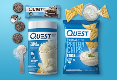
The mission of El Segundo, CA-based Quest Nutrition is to make the foods consumers crave work for them and not against them by making versions of their favorite foods that are low in net carbs, high in complete protein, and low in sugar. First disrupting the protein bar category, in a few short years, Quest has expanded its food portfolio to include cookies, chips, powders, and now even pizza. The brand grew so quickly that a refreshed and consistent packaging system was needed to tie the entire portfolio together. And as the protein bar category becomes increasingly cluttered with multiple brands on shelf, consumers need to be able to find Quest and understand the quality difference quickly. They turned to Chase Design Group to help them achieve this goal.
The Chase team started with the logo, using a bold, sans-serif font and making the custom “Q” slightly larger. Design exploration revealed that the original signature letter “E,” designed as three floating bars to signify energy and movement, was the most memorable component, so it was adapted to work with the other letters.
The protein bar is known for its many tasty flavors, so the packaging needed to work harder to create the “craveable” taste consumers expected. Mouthwatering food photography became the main focus of the redesign. According to Dave Carlino, Senior Art Director, Chase Design Group, “We chose a dessert to represent each flavor and gave prominence to the food imagery. Then, we contrasted the rich, indulgent colors of the desserts with bright, vibrant background colors and created fun secondary illustrated icons for each flavor to add some playfulness.”
The redesign spans 80 SKUs—from protein bars to protein powders, chips and protein cookies— including corresponding cartons and shippers. Consistency was key across all categories. “Because of category norms, we needed to address each one’s unique needs. In some cases, we led with flavor, and in some cases, we led with form, but we stuck to a similar pack architecture across the portfolio,” notes Carlino. This consistency resulted in an unmistakable Quest look for the family of products and allows for easy extension for future products.
Chase also developed the Brand Toolkit, covering everything from logo usage to packaging architecture and line extension strategy.
According to Ben Spink, Creative Director for Quest Nutrition, “Refreshing packaging for a brand that consumers already love is tricky. It’s a careful balance between staying true to the essence of the brand while enhancing key elements that make it stand out on shelf, cut through the clutter, and ultimately make it easier for consumers to find their favorite flavor. Chase Design Group was a great partner in this quest, and our fans are already responding to the amazing new look.”