Anheuser-Busch brand Lime-A-Rita, a line of premixed margaritas in a variety of fruit flavors, has received a head-to-toe makeover, encouraging female consumers to “Make it a Margarita Moment.” With the brand redesign and a new marketing campaign, Lime-A-Rita has become the first product in Anheuser-Busch’s U.S. portfolio to market exclusively to women.
According to Anheuser-Busch, since Lime-A-Rita’s arrival on shelves in 2012, the RTD mixed drink has resonated with women. “Today, women represent 51 percent of the U.S. population and drive 85 percent of consumer purchasing decisions through their influence and buying power,” the company says. “Paired with the knowledge that female drinkers are strong advocates for Lime-A-Rita, the brand saw a unique opportunity to transform a beverage category that it successfully reinvigorated five years ago.”
At the time of the redesign, existing graphics for Lime-A-Rita’s aluminum can packaging were “great,” says Selena Kalvaria, Senior Director for Lime-A-Rita. “But we wanted something that embodied the new direction of the brand—an elevated visual expression of the fun and dynamic personality of Lime-A-Rita,” she adds.
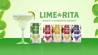
To bring the bold flavors of the brand to life, while reflecting the product’s vibrant, playful, and lively qualities, Lime-A-Rita used pop art-inspired creative, and simple fruit-and-flavor-first messaging. Graphics for each variety—there are six core flavors, and one seasonal—include colorful drawings of fruit specific to that flavor and a margarita glass with its contents splashing invitingly. “The elements of the design that remained the same include the brand font and the margarita glass, to bring the ready-to-drink message front and center,” says Kalvaria.
Another design element that was retained was the Bud Light logo at the top of the front panel, although it has been greatly reduced in size.
Lime-A-Rita is packaged in 8-, 16-, and 24-oz cans, sold in 12- and four-pack cartons, and single cans, respectively. The cans are supplied by Ardagh, Ball, and Anheuser-Busch Packaging Group/Metal Container Corp. and are printed in six opaque and transparent colors.
The new packaging launched in March 2017 and was completely rolled out on shelves by summer 2017. “We’ve seen a positive response from consumers,” says Kalvaria. “They see the new design as an elevated expression of the brand’s fun and vivacious nature. With the new design, Lime-A-Rita stands out on shelf and attracts consumers through colorful and flavor-first messaging that resonates with them.”