In the late 19th century, researchers discovered the antibacterial qualities of honey, but today we know that not all honey is the same. That’s why Malvern, PA-based Wedderspoon, the number one-selling Manuka Honey brand in North America, needed to clearly communicate its point of difference to a global audience of wellness-minded mainstream consumers. The honey is sourced from New Zealand, where bees feed off the nectar of the Manuka flower.
Wedderspoon turned to Seattle-based brand strategy firm Retail Voodoo to rebrand and create new product lines beyond jarred honey. According to David Lemley, Founder/Chief Strategist, Retail Voodoo, “We helped Wedderspoon clearly communicate that they are the only brand to take a stand for 100-percent raw non-GMO Manuka products with superior medicinal properties and allow them to expand outside the natural channel for growth.”
This began with a new mission statement: to mainstream Manuka honey by making products to help busy modern people buzz with vitality. Retail Voodoo’s strategy work focused on expanding the audience for Wedderspoon by finding products and communication strategies that would resonate. The three new product lines include Manuka Honey Plus Shots, Apple Cider Vinegar with Manuka Honey, and six fresh skincare products for face, hands, and body.
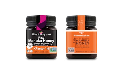
Once the product lines were chosen, a communication toolbox and design language were chosen for rebranding existing products and applying to new ones. The bright, inviting look and feel is more premium, approachable, and easier to read with strong shelf presence playing off the brand positioning, “buzzing with vitality.”
“Retail Voodoo led our team through the process from brand positioning to final design in order to create cohesive, spectacular imagery across six categories that captures the heart of Wedderspoon,” says Rebecca Remley, CEO, Wedderspoon.
The new wordmark and typography are sophisticated, clean, and approachable for a global audience, while the symbol, a whimsical bee logo, equates Manuka with honey. Color is used to differentiate and emphasizes product characteristics, and a bee watermark and brown rules serve as the primary graphic elements used on packaging and off-pack applications.
“The rebrand strengthens their strict rating system, commitment to sustainability, and visionary approach to creating new products,” notes Lemley. “They are creating a global community of loyal followers dedicated to living with authenticity and vibrancy.”
Adds Remley, “We appreciated the methodical approach that Retail Voodoo deployed throughout our engagement, from diagnosis to the final design phase.”
The new products began rolling out this summer.