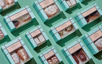
High-end U.K. supermarket chain Booths’ has redesigned the packaging for its range of puddings and cakes to bring glamour back to teatime. The design was done by creative and strategic branding partnership Smith&+Village.
For many years, Booths sold cream cakes from specialist bakery Lathams, a Lancashire firm, but they wanted to migrate the products to the Booths branding, while maintaining the positive associations with Lathams.
Smith&+Village took inspiration from the Art Deco days of teatime and injected a strong sense of identity into the range, while keeping Lathams credited on the front of the package to maintain some consistency in consumer trust.
“Our solution was to give the range a very strong identity,” says Debrah Smith, Creative Director, Smith&+Village. “Using a pattern and colors that feel very contemporary, but hark back to the Art Deco decadence of high tea, has given the products a clear sense of identity, a strong shelf presence, and just a touch of glitz and indulgence.”
The strategy devised by Smith&+Village for Booths’ label is used on the range of puddings and cakes, with a concentration of the brand achieved using a small, but unique color palette of creative elements.
The striking and bright packaging features a mix of typography, color, and a Booths’ twist: There are no photos or confusing category language.
The strategy for the brand and the design reflects Booths’ premium and heritage positioning, while making it relevant for the modern consumer, says Smith&+Village.