Color is the standout component of the communication function of packaging, discernible from a greater distance than other components, such as shape, copy, and graphics. Color is indispensable to packaging; furthermore, printing technologies, as well as color additives, make possible virtually every color, tone, and shade. The wealth of choice is as challenging as it is enabling. That’s because, outside of a few irrefutable truths, the psychology of color is mostly subjective, conditional, and sometimes contradictory.
One truth is that color is evocative, possessing the power to trigger emotions and attitudes—whether positive or negative. Another truth is that color is associative, reactions to it rooted in one’s experiences; and, because of that property, the color scheme of a package can influence emotions and attitudes about the product—again, whether positive or negative. Those two truths combine for this one: in order for color to contribute to the successful matching of product and target consumer, it’s necessary to know pertinent details about both.
Unfortunately (or fortunately, depending on one’s perspective) the psychology of color is not an all-objective science that crowds out all subjectivity. Specific to packaging, there have been instances wherein color “rules” that previously were promoted as inviolate have been breached successfully; for example, there was a time when black wasn’t to be used in food packaging. The lesson is not to be unduly restrained by convention, yet recognize that one first should be acquainted with convention, in order to diverge from it knowingly and strategically.
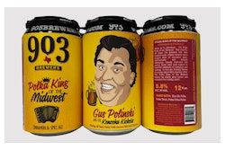
Nonetheless, there can be times when convention should be honored. A prime example is when a product mandates a particular color due to a defining ingredient/flavor. Banana, strawberry, grape, etc., necessitate the use of yellow, red, and purple, respectively; but even then, there’s the decision on how to team a defining color with other colors, into an effective color scheme.
But in all cases, a decision-maker should be distrustful when color psychology is presented in a manner that’s formulaic. Mention blue and some people might think of sky but others might think of sadness. Mention green and one might get a dichotomy as diverse as nature and slime. Yellow can be as easily associated with sunshine as with cowardice. Distrust also is warranted when color psychology is used to characterize personalities. In some applications it might have credibility; for example, people who prefer red cars supposedly share certain personality traits. But when color psychology is applied uncritically in characterizing consumers of packaged goods, it might be no more reliable than astrology.
Given the many variables linked to color, decision-makers need to conduct research, but what methodologies are more likely to be effective? If respondents are directly asked about colors in reference to packaging, they might not be able to articulate meaningful answers, having not thought about color in isolation from other aesthetic components—after all, packaging is supposed to communicate as a gestalt. On the other hand, when the questioning is too indirect, analysts have to interpret and divine, and those skills are not equally possessed by all analysts.
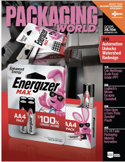
Researching color for packaging is different from, say, researching for the fashion industry. With the latter, there’s an emphasis on trends, i.e. which colors will be in demand for whatever season is under consideration. With packaging (or trade-dress, to use a comparative term) colors should be chosen with an emphasis on longevity. That’s how brands obtain flagship colors—Tide’s orange, Campbells’ red & white, Cherrios’ yellow, and so forth. When a brand “owns” its colors, so to speak, background colors and other aesthetic components might undergo occasional updating, but the flagship colors communicate continuity of the brand’s franchise with the consumer. Flagship status doesn’t mean that the colors were the logical choices for the brand, exclusive of other possible choices; rather, it means that the colors were not incompatible with consumers’ perceptions and expectations. That hurdle cleared, it’s the branded product’s quality, performance, pricing, promotion, and availability that account for longevity and allows the brand’s colors to become flagship.
So rather than think in terms of perfect colors, a decision-maker would be better served by subscribing to the Hippocratic Oath: First, do no harm (that is, making sure that the colors won’t sink the branded product’s chances for success). And when the product is based on a simple concept, with a difference that’s relevant to the target consumers, it’s easier to communicate those traits with colors. In particular, the requirement of being different (not a me-too product) is liberating regarding choosing colors for packaging because it justifies going afield of whatever colors dominate the product category (and in the rarer instance of a new category, the liberty is almost unbridled).
But regardless of category, effective differentiation always is desired. That’s something to be kept in mind in the age of sustainability, when numerous companies have succumbed to a too broad-brush application of greens and Earth-tones. On a related note, regulatory agencies are increasingly challenging the sustainability claims that appear on packages; therefore, strategic-minded brand-owners should be receptive to ways to give a greater role to color schemes vs. copy to denote sustainability. To do so, tap into colors’ abilities to symbolize and to operate on the conscious and subconscious levels.
In wrap-up, it’s essential to appreciate that the choice of colors for packaging is complex, fraught with many intricacies. Never is it a matter of black and white.
Sterling Anthony is a consultant, specializing in the strategic use of marketing, logistics, and packaging. His contact information is: 100 Renaissance Center- Box 43176; Detroit, MI 48243; 313-531-1875 office; 313-531-1972 fax; [email protected]; www.pkgconsultant.com


