Stunning on shelf, honey packaging for newcomer Buzz + Bloom comes in an array of formats to encourage new use occasions. Here, Buzz + Bloom Director of Procurement Brian Showerman shares insights on the selection of the packaging and graphics for the ‘floral-forward’ brand.
Packaging World:
Can you provide some background on your company? What inspired you to create the Buzz + Bloom brand?
Brian Showerman:
Buzz + Bloom Honey is inspired by the amazing relationship between bees and flowers. Flowers—and the valuable nectar and pollen they share with the bees—are the very essence of our floral-forward honey varietals and the beauty inspiration for our packaging. Whether the honey is derived from a faraway lychee fruit tree or fresh citrus groves, we carefully preserve the journey from flower to hive to home and maintain the highest-quality honey on the market.
What differentiates your honey from others on the market?
Buzz + Bloom reflects the idea that not all honey is the same in terms of color or flavor, and that the amazing diversity of honeys can be used in different ways. In addition, we believe honey is perfect as it’s found in nature, so we take care to preserve the natural pollen and beneficial enzymes that make honey such a superfood.
When did you begin developing the packaging for your products?
We started development of the Buzz + Bloom packaging in 2016. The package structures were actually preferred by consumers who provided feedback as part of our market research efforts. We learned that the predominant package structure in the market—the classic PET bear—is often seen as containing inexpensive, undifferentiated, and highly processed honey. Instead, consumers were looking for packaging they could be comfortable leaving out on the table or countertop instead of hiding it in the cupboard.
What were your functional and aesthetic goals for the packaging?
In general, there were three priorities for Buzz + Bloom packaging. First, to showcase the natural beauty of the honey we offer. Second, to provide consumers an alternate choice to the standard packaging options available in the category—one that could reflect their personal style and that wouldn’t be hidden in the cupboard. Third, to have an engaging presence in-store. Since overall purchase frequency in this category is relatively low, it was important to demonstrate to retailers that Buzz + Bloom will connect with consumers in a way that brings them back to the category on a more consistent basis.
Can you describe the types of packages you use, and why you selected them?
For the premier line, which includes Buzz + Bloom’s Organic Non-GMO, Fair Trade, and Raw & Unfiltered varieties, we opted for a square glass jar. We’re seeing growth in the use of glass in the category as a better way to preserve the honey as well as reinforce the premium nature of select varieties. The square jar is distinct in the category and really showcases the different colors and flavors of honey that are available.
Our 8-oz size, which includes Buzz + Bloom’s Light & Sweet and Bold & Floral varieties, offers a quantity and price point that encourages shoppers to explore the natural diversity of tastes, textures, and colors found in pure honey. The unique teardrop shape was selected to stand out at shelf, and the integrated flip-top cap and flow-control valve help with portion control and reduce unwanted spills or drips. We partnered with Weener Plastics to find the right bottle and cap for Buzz + Bloom to provide the functional and aesthetic properties we were looking for.
Buzz + Bloom spreadable honeys are packed in a wide-mouthed PET cylinder with a screw-top cap. Ease of access was a priority with this product format, which has a creamy, almost peanut butter-like consistency and spreads easily with a knife onto an English muffin or toast. Most package structures on the market for this type of honey consist of an opaque tub, but we felt it was important to showcase the honey inside the package, and broaden the appeal of the product form with a more contemporary look and feel.
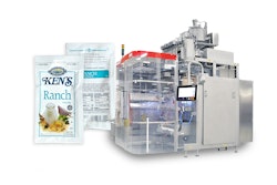
For Buzz + Bloom’s single-serve offering of Organic Non-GMO honey, durability was extremely important to consumers. Honey is sticky, and our consumers would not accept a packaging form that could break or burst in their backpack or purse. The single-serve packets of Buzz + Bloom allow for greater portability, convenience, and portion control than the typical household sizes of honey.
Can you describe the elements of the design and how they convey the brand essence?
The overall design of Buzz + Bloom packaging is really singularly focused on calling attention to the honey itself. The use of clear PET and glass containers and transparent labels reflects a minimalist approach designed to showcase the natural beauty of the pure honey product inside. We take great pride in the honey we collect, and it’s important to share that appreciation for the abundance of nature with our consumers.
The choice for cap and lid color also stems from our focus on the purity and diversity of natural honey. The bright cyan blue cap is a complementary color to the natural brown and orange hues of the honey, which serves to naturally focus even greater attention on the product inside the container. This non-traditional color also stands out from the traditional use of beige, red, and yellow colors so prevalent in the category. Packaging graphics for the Buzz + Bloom line were created by our design partner, Fear Not.
What has been the response from retailers? From consumers?
Buzz + Bloom launched in September 2016. Since then, we’ve seen an outpouring of love for our brand from both retailers and consumers, and we continue to see distribution grow. Consumers enjoy the variety of honeys we offer from different floral sources, and they love adding our beautiful product packaging to their kitchens. We’re excited to keep up the momentum and see what the next year brings us.