Served in 9 out of ten Indian restaurants in the United Kingdom, Kingfisher Beer, Bangalore, India, is locally known in Britain as the Real Taste of India. KBE Drinks, the European division of the Kingfisher business, recently debuted a new, restaurant-only IPA craft beer innovation called Bombay Bicycle. The project would require branding and packaging design of that would allow restaurant-goers to make the connection between a new, flavorful beer, and an entire continent’s characteristic cuisine. Design and communications agency Butcher & Gundersen has worked with KBE Drinks for years, and was once again up to the task with this new beer label.
“Whilst the majority of consumers are still looking for a cool, crisp lager to match with their Madras, there are many people now looking for a more flavorful beer to complement their Korma,” says John Price, Head of Marketing, KBE Drinks. "We are] well-placed to establish a craft brand within this important trade sector, and from our past experience working with the agency, we knew that Butcher & Gundersen had the right expertise to ensure we leverage this opportunity to the full in the brand’s design.”
Formulated with the help of several top Indian chefs using Cascade and Chinook hops to ensure the beer pairs exceptionally well with Indian food, the design needed to work just as hard in order to complement the Indian restaurant environment.
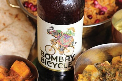
Butcher & Gundersen created a tongue-in-cheek visualization of the brand’s name to bring to life the warmth, irreverence and humor of Indian culture in the shape of a painted elephant riding a bicycle. The fun design and typography are inspired by the traditional architecture, signage, fashion, comic imagery, and artistry of the region when the modern city of Mumbai was known as Bombay.
Brought to life in the bright colors of the Elephant’s howdah and the graphic filigree of the Bombay Bicycle typography, flashes of gold in the crown, neck and primary label ensure the design stands out in the restaurant setting. Further elevated by a tactile, off-white label giving the design a premium finish and ensuring the consumer experience is as positive in the hand as it is on the eye.
The label uses a permanent adhesive and is machine-applied from rollstock by converter Label Apeel. The label material is a white polypropylene substrate, which gives a premium finish with a matte, soft-touch feel in the hand.
The 60-micron-thick label is flexo printed in four colors (CMYK) plus 70% of pantone 7527 with a gold hot foil stamp and matte varnish.